


Since I’m a designer, I’ve always been interested in typography (I’m that kind of weird person who collects typeface paper specimen). I’ve read a lot of books, done researches about font rendering, wrote articles on multiple websites and so on. So, in 2010, after a web conference in Paris, when the Ffrench publisher, Atelier Perrousseaux (from the renewed typographer Yves Perrousseaux), specialized in typography, asked me to write a book about font legibility issue on the web, I didn’t wait for too much to say yes.
Writing a book to talk about typeface legibility improvement on screen...
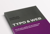
Atelier Perrousseaux
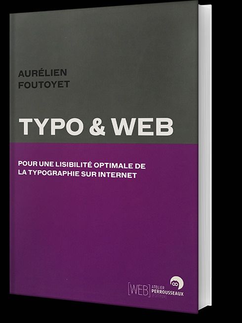
Book
Author
CHAP 1.0
Why this book ?
Nowadays in 2016, with the improvement of screen quality, font rendering has evolved a lot. But, when we looked back in 2010, it was a real issue. At that time, the web fonts have just entered into the web design game, and we saw lots of crappy web page rendering due to not so wise font choices.
With this book, I wanted to offer a deep investigation into the font rendering issue and how could we solve it on the web. More of a technical book, it’s also a book about typeface history, screen constraints, and concrete tools to make better font choices on the web.

FIG #1. DIFFERENT TYPE OF FONT RASTERIZATION ON SCREEN
CHAP 2.0
Table of content
I wanted to write a book that I would be glad to read myself. The main problem could have been to write something too technical so I've tried to follow a simple and pedagogical approach. In this book, I've not only given concrete methods and tools to improve font choices on screen but I've also talked about the reading process, typeface history and much more.
- Chap. 1 What is legibility?
- Chap. 2 How do we read?
- Chap. 3 Screen readability characteristics
- Chap. 4 Improving typographic choices
- Chap. 5 The shape of letters
- Chap. 6 Webfont rendering
- Chap. 7 Readability and CSS
- Chap. 8 Case studies
[unex_ce_button id="content_p4vgjx1uy,column_content_s7nje8m2p" button_text_color="#010101" button_font="semibold" button_font_size="15px" button_width="auto" button_alignment="center" button_text_spacing="2px" button_bg_color="#ffffff" button_padding="20px 60px 16px 60px" button_border_width="0px" button_border_color="transparent" button_border_radius="0px" button_text_hover_color="#ffffff" button_text_spacing_hover="2px" button_bg_hover_color="#00e1a9" button_border_hover_color="transparent" button_link="http://www.calameo.com/read/000219963bb28f8dfbd41?authid=LdtAZ6Esb0P1" button_link_type="url" button_link_target="_blank" has_container="" in_column="1"]READ A PREVIEW (fr)[/ce_button]
I’m sorry for non-native french people but this book has only been edited in french. The excerpt and readers reviews are displayed in this language.
Available on paper cover and ebook format
ISBN 978-2-911220-90-6 168 pages FR only
CHAP 3.0
Readers feedbacks
Ce livre de l'ami @allfordesign est un must-have! Commandez-le maintenant! http://instagr.am/p/M6DMW6NN38/
_ Jeremy Fontana, Art Director
J’ai fini “Typo & Web” de @allfordesign : exhaustif, (très) documenté, précis, lisez-le si le sujet vous intéresse.
_ Christophe Andrieu, Designer
Merci beaucoup pour avoir écrit Typo et Web, j’ai appris beaucoup de choses sur les rendus des fontes sur écran.
_ Thomas Dixneuf, Graphic Designer
Le livre d’Aurélien Foutoyet apporte des réponses précieuses à des questions posées par des technologies s‘étant déployées ces trois dernières années comme les font-faces...
_ Typofonderie, Digital type foundry
Rien de plus agréable quand on finit un livre de se dire : j'ai appris et compris plein de choses ! Le format se veut court et clair, on ne tombe pas dans le pavé de 800 pages.
_ Nicolas Hoffman, web developer
Je sens qu'il va rester à côté de mon clavier un bon moment, tellement y a de ressources utiles #typo
_ David Cadusseau, Freelance Designer
Let's talk together